Theme: Palettes, Shapes, Recolored Assets
You will learn
- What
beautifulis and howbeautiful.init()turns one Lua table into the styling source for every widget - How named palettes plus semantic color roles let one variable switch the entire look
- How to enforce one font family and DPI-aware sizing across the whole config
- How a global shape switch and
gears.color.recolor_imagekeep assets in sync with the theme
Where We Are
In chapter 00 we toured the baseline rc.lua and got it running in a nested test session. It works, but it looks like 2008: the default theme, the default xterm, the default everything. This chapter replaces the built-in theme with our own theme/theme.lua, an 834-line file that will style every single widget we build for the rest of the series. To catch up: git checkout 00-default.
What Beautiful Actually Is
Every visual thing in AwesomeWM, from the bar to notification popups to window borders, reads its styling from one shared table. The module that holds that table is called beautiful. There is no CSS, no stylesheet language, nothing exotic: a theme is a plain Lua file that builds a table and returns it, and beautiful.init(path) loads that file and adopts the table as the global theme.
The contract is simple and worth internalizing now, because we lean on it in every remaining chapter:
- Anything you assign as
theme.fooin the theme file can be read asbeautiful.foofrom anywhere in the config. - Built-in keys are read by the window manager's own Lua.
bg_normal,border_width,font, and a few hundred more are looked up by the shipped widgets and libraries, so setting one changes how something draws without you writing a line to connect it. Leave one unset and that component falls back to its own default. - Keys you invent are read by your code and nothing else.
theme.primary_coloris a perfectly good theme entry, readable asbeautiful.primary_colorfrom any module you write, but no code in SomeWM or AwesomeWM will ever go looking for it. It changes nothing until one of your own widgets asks for it.
That second distinction is worth holding onto, because most of this file is invented keys. beautiful.primary_color, beautiful.shape, and beautiful.font_size get used in later chapters as if they were built in. They are not. They are ours, defined today, and they work only because we also write the widgets that read them.
In rc.lua, the stock config loaded the theme shipped with AwesomeWM. We point it at ours instead:
-- rc.lua
beautiful.init(config_dir .. "theme/theme.lua")
Where does config_dir come from? The very top of rc.lua, before anything else runs:
-- rc.lua
local config_dir = require("gears.filesystem").get_configuration_dir()
package.path = config_dir .. "?.lua;" .. config_dir .. "?/init.lua;" .. package.path
gears.filesystem.get_configuration_dir() asks the running compositor where the rc.lua it actually loaded lives, rather than guessing at a hard-coded path. Both somewm and AwesomeWM implement it identically, so the same config works from ~/.config/somewm, ~/.config/awesome, or a git checkout you pointed a nested test session at. The returned path always ends in a slash, which is why we concatenate "theme/theme.lua" without one. The package.path line makes require("wibar") and friends resolve to files sitting next to rc.lua, which becomes essential once we start splitting the config into modules.
Where This File Comes From
theme/theme.lua started as a copy of the default theme your window manager ships, the same file chapter 00's beautiful.init line was loading. Run one of these from the root of the checkout.
On SomeWM:
mkdir -p theme
cp /usr/share/somewm/themes/default/theme.lua theme/theme.lua
cp /usr/share/somewm/themes/default/submenu.png theme/
cp -r /usr/share/somewm/themes/default/layouts theme/layouts
On AwesomeWM:
mkdir -p theme
cp /usr/share/awesome/themes/default/theme.lua theme/theme.lua
cp /usr/share/awesome/themes/default/submenu.png theme/
cp -r /usr/share/awesome/themes/default/layouts theme/layouts
Both are packaged-install paths. A source build lands under /usr/local instead (/usr/local/share/somewm/themes/, /usr/local/share/awesome/themes/). If neither exists, ask the running window manager, which is the same call beautiful uses internally:
somewm-client eval 'return require("gears.filesystem").get_themes_dir()'  # SomeWM
awesome-client 'return require("gears.filesystem").get_themes_dir()'      # AwesomeWM
The two default themes are the same file: 133 lines on SomeWM, 139 on AwesomeWM, differing only in where a few long calls wrap. Their assets are byte-identical, so the rest of this chapter reads the same either way.
What you now have is the requires block, every built-in variable name in a working order (font, bg_* and fg_*, useless_gap, borders, taglist, menu, titlebar buttons, the sixteen layout icons, return theme), and images that already load. theme/submenu.png and the sixteen layout icons on this branch came out of that directory unchanged; only theme/titlebar/square.svg and rounded_square.svg are new artwork. Some lines survive untouched, theme.awesome_icon = theme_assets.awesome_icon(...) among them.
The branch keeps only the sixteen white layout icons (*w.png), the ones the theme recolors. The black variants and the default's taglist/ and titlebar/ PNGs go unused, so cp -r bringing extra files along is harmless.
The rest of this chapter is edits to that copy:
| The default theme | What we turn it into |
|---|---|
Hex codes inline (theme.bg_normal = "#222222") | Named palettes plus semantic roles |
themes_path = get_themes_dir(), assets read from the install | theme_path = config_dir .. "theme", assets vendored beside rc.lua |
| Image paths used as-is | Every image passed through recolor() |
theme.font = "sans 8" | One font_family and a theme.font_size() builder |
theme.wallpaper pointing at a shipped PNG | A per-screen wallpaper list in rc.lua |
theme.icon_theme = nil | "Papirus" |
Taglist square markers from theme_assets | Dropped. The chapter 04 taglist renders icons instead |
An urgent-notification ruled.notification rule | Dropped. Chapter 06 rebuilds notifications from scratch |
Point beautiful.init at your copy and reload before changing anything, so you know the copy itself is sound.
The theme file itself starts by grabbing the same tools:
-- theme/theme.lua
local gears = require("gears")
local theme_assets = require("beautiful.theme_assets")
local xresources = require("beautiful.xresources")
local dpi = xresources.apply_dpi
local recolor = require("gears").color.recolor_image
Two of those locals, dpi and recolor, are the workhorses of this file. We will meet both shortly.
Palettes: Named Colors, One Switch
The first design decision in this theme is that raw hex codes appear in exactly one place: a colors table holding complete named palettes. Here is the start of it:
-- theme/theme.lua
local colors = {
  gruvbox = {
    bg = "#282828", -- bg(0) in palette
    fg = "#ebdbb2", -- fg(15) in palette
    grey1 = "#928374", -- gray in palette
    grey2 = "#3c3836", -- bg1 in palette
    red = "#cc241d", -- red(0) in palette
    soft_red = "#fb4934", -- red(9) in palette
    green = "#98971a", -- green(2) in palette
    soft_green = "#b8bb26", -- green(10) in palette
The gruvbox palette continues through yellows, blues, purples, and oranges, each entry keyed by a role-neutral name (blue, soft_blue, orange) rather than by what it is used for. Right below it sits a second complete palette, nord, with the exact same keys mapped to Nord's Polar Night and Frost colors. Because both palettes answer to the same key names, everything downstream is palette-agnostic, and the actual selection is two lines:
-- theme/theme.lua
local color_scheme = "gruvbox"
local color = colors[color_scheme]
Change "gruvbox" to "nord", reload, and every widget in the config re-skins itself. Nothing else in this file, and nothing in any later chapter, ever mentions a palette by name again: everything reads color.something.
The Nord palette repeats a few hexes (red and soft_red are both #BF616A, for example). Nord simply has fewer accent colors than gruvbox, so the "soft" variants collapse onto their base color. The keys still exist so lookups never fail.
Semantic Roles: The Layer That Makes Switching Work
Palettes alone are not enough. If a widget asked for color.orange directly, switching to a palette where orange plays a different part would mean editing the widget. So the theme adds a second layer: semantic role variables that describe what a color is for, assigned from the palette:
-- theme/theme.lua
theme.primary_color = color.orange
theme.primary_color_hover = color.soft_orange
theme.active = color.green
theme.active_hover = color.soft_green
theme.accent = color.yellow
theme.accent_hover = color.soft_yellow
theme.highlight = color.blue
theme.highlight_hover = color.soft_blue
theme.urgent = color.red
theme.urgent_hover = color.soft_red
theme.fg_dim = color.grey1 -- secondary text: dates, hints, muted status lines
Every role has a _hover variant so interactive widgets can brighten on mouse-over without inventing colors on the spot, and fg_dim gives us a standard muted text color for dates, hints, and status lines. From here on, widgets in this series only ever ask for roles: a toggle that is on uses beautiful.active, a launcher's selected row uses beautiful.primary_color, a battery warning uses beautiful.urgent. When you swap the palette, or design your own, the roles re-map and the entire UI follows. This two-layer scheme (palette keys below, roles above) is the single most valuable habit in this file.
The built-in keys AwesomeWM cares about are assigned from the same palette:
-- theme/theme.lua
theme.bg_normal = color.bg
theme.bg_focus = color.grey2
theme.bg_urgent = color.soft_red
theme.bg_minimize = color.grey1
theme.bg_systray = color.bg
bg_normal and fg_normal are the defaults nearly everything inherits: bars, popups, tooltips. If you set only two theme variables in your life, set those.
One Font Family, One Builder
Fonts in AwesomeWM are plain strings like "JetBrainsMono Nerd Font Bold 14", which makes it easy to scatter slightly different family names across twenty widget files. This theme forbids that with a rule: the family is written once, and everything else builds on it.
-- theme/theme.lua
theme.font_family = "JetBrainsMono Nerd Font"
function theme.font_size(size, style)
  return theme.font_family .. " " .. (style and (style .. " ") or "") .. size
end
theme.font = theme.font_size(10)
Notice the theme table can hold functions. beautiful does not care what type a value is, so beautiful.font_size(24, "Bold") is callable from any widget and returns "JetBrainsMono Nerd Font Bold 24". Every font string in the remaining twelve chapters goes through this builder. This way, changing the font for the entire desktop, clock, launcher, notifications, lock screen, all of it, is a one-line edit to theme.font_family.
DPI-Aware Sizing
Pixel values in a theme are a trap: 8 pixels of gap looks right on a 1080p monitor and microscopic on a 4K laptop panel. The fix is xresources.apply_dpi, aliased to dpi at the top of the file. It scales a value by the screen's DPI, so dpi(8) means "8 pixels at standard density, proportionally more on dense screens."
-- theme/theme.lua
theme.useless_gap = dpi(8)
theme.border_width = dpi(1)
theme.border_color_normal = color.bg
theme.border_color_active = color.soft_orange
theme.border_color_marked = color.red
useless_gap is AwesomeWM's name for the empty space between tiled windows ("useless" because it serves no function except looking good). Note that this theme also derives other sizes from it: near the bottom of the file, theme.wibar_height = theme.useless_gap * 5 and the wibar margins are theme.useless_gap * 2. One knob controls the whole spacing rhythm. The rule for the rest of the series: every size in the config goes through dpi(), no bare pixel numbers.
The Shape System
AwesomeWM widgets accept a shape, which is just a function that draws an outline on a Cairo drawing context: function(cr, width, height). The gears.shape library ships a pile of them (rectangles, rounded rectangles, hexagons, arrows). Rather than hard-coding a shape per widget, this theme defines one global style switch and two shape functions that consult it:
-- theme/theme.lua
-- Global shape setting: "rectangle" or "rounded"
-- Change this single setting to switch all widget corners
theme.shape_style = "rectangle"
theme.corner_radius = 12 -- Only used when shape_style = "rounded"

-- Helper function to get the appropriate shape
-- Usage: beautiful.shape(cr, w, h) or beautiful.shape
function theme.shape(cr, w, h)
  if theme.shape_style == "rounded" then
    gears.shape.rounded_rect(cr, w, h, theme.corner_radius)
  else
    gears.shape.rectangle(cr, w, h)
  end
end
A second helper, theme.shape_small, does the same with half the radius (capped at 6) for inner elements like buttons and toggles, so nested rounded corners do not look inflated. Any widget that wants to match the theme just sets shape = beautiful.shape. Flip shape_style to "rounded" and every corner in the config rounds at once, which is exactly the kind of leverage the palette switch gave us for color.
Recoloring Assets at Load Time
Themes need images: titlebar buttons, layout indicator icons. The naive approach is to ship one image per color per state, which explodes fast (close button, focused and unfocused, times two palettes, times every accent color). This theme ships each asset exactly once, as a shape, and tints it at load time with gears.color.recolor_image, aliased to recolor. It takes an image path and a color, and returns an in-memory copy with the artwork repainted in that color.
The titlebar buttons show the whole idea, including a nice interaction with the shape system:
-- theme/theme.lua
-- Button icon switches based on shape_style
local titlebar_icon = theme.shape_style == "rounded" and theme_path .. "/titlebar/rounded_square.svg"
  or theme_path .. "/titlebar/square.svg"

-- Unfocused (normal) = dimmed gray, Focused = colored
theme.titlebar_close_button_normal = recolor(titlebar_icon, color.grey1)
theme.titlebar_close_button_focus = recolor(titlebar_icon, color.soft_red)
There are exactly two SVGs in theme/titlebar/: a square and a rounded square. The shape_style switch picks which one, and recolor produces every color variant from it: gray for unfocused windows, soft red for a focused close button, soft yellow and soft orange for the floating toggle, soft green for maximize. The same trick covers the sixteen layout icons, which ship as white PNGs and get tinted to the palette's foreground color:
-- theme/theme.lua
theme.layout_fairh = recolor(theme_path .. "/layouts/fairhw.png", color.fg)
theme.layout_fairv = recolor(theme_path .. "/layouts/fairvw.png", color.fg)
theme.layout_floating = recolor(theme_path .. "/layouts/floatingw.png", color.fg)
Switch the palette and the icons re-tint automatically on the next reload. No image editor involved, ever. We reuse recolor heavily in the widget chapters, where a single set of white SVG icons serves every color the theme needs.
The Commented Reference Block
Around a third of this file's 834 lines look like this:
-- theme/theme.lua
-- theme.arcchart_bg = nil
-- theme.arcchart_border_color = nil
-- theme.arcchart_border_width = nil
-- theme.arcchart_color = nil
That is every name the window manager's own code looks up, copied from the appearance documentation and interleaved with our real settings, so the file doubles as a browsable reference: to style tooltips, find the tooltip_ block, uncomment a line, give it a value. It also accounts for most of the distance between the 133-line default and this file.
theme.foo = nil is not a no-op, it erases theme.foo. These lines sit after the real settings, so uncommenting one and leaving it nil deletes the value set two hundred lines earlier.
The Rest of the File
You now have the machinery; the remaining several hundred lines are just that machinery applied group by group. Notification popups get theme.bg_normal .. "F8" (an alpha suffix for semi-transparency), theme.shape, and role colors. The taglist maps states to palette entries (taglist_fg_focus = color.soft_yellow, taglist_fg_occupied = color.orange). The hotkeys popup, menubar, tooltip, and wibar blocks follow the same pattern: built-in variable names on the left, palette entries, roles, dpi() calls, and theme.shape on the right. There is also a systray_icon_style function providing per-app tray icon styling, a somewm extension that AwesomeWM silently ignores. Browse the branch; nothing in there will surprise you after this chapter.
The file ends the only way a theme file can:
-- theme/theme.lua
return theme
Wallpapers in rc.lua
Back in rc.lua, the stock config painted one wallpaper from beautiful.wallpaper. We replace it with a per-screen list and a defensive setter:
-- rc.lua
local wallpapers = {
  config_dir .. "wallpapers/penguin.jpg",
  config_dir .. "wallpapers/spaceman.jpg",
}

local function set_wallpaper(s)
  local wp = wallpapers[s.index] or wallpapers[1]
  if wp and gears.filesystem.file_readable(wp) then
    gears.wallpaper.maximized(wp, s, true)
  else
    -- Fallback to gruvbox dark color
    gears.wallpaper.set("#282828")
  end
end

screen.connect_signal("request::wallpaper", function(s)
  set_wallpaper(s)
end)
Three details worth copying. The table is indexed by screen number, so a two-monitor setup gets two different wallpapers and any extra screens reuse the first. gears.filesystem.file_readable guards against a missing file: a fresh clone, a moved image, a typo, none of them crash startup; you get a solid gruvbox background instead of an error notification. And the whole thing hangs off the request::wallpaper signal, which the compositor emits per screen at startup and again whenever a screen's geometry changes, so plugging in a monitor repaints correctly with no extra code. The images ship in the repo under wallpapers/, addressed via config_dir like everything else, so they work from any checkout location.
Screen Scaling somewm-only
The same commit adds a small opt-in scaling table:
-- rc.lua
local screen_scales = {
  -- [1] = 1.5,
}

awful.screen.connect_for_each_screen(function(s)
  local scale = screen_scales[s.index]
  if scale then
    s.scale = scale
  end
end)
screen.scale is fractional output scaling, a Wayland capability with no X11 equivalent, so this is somewm-only. On AwesomeWM the table ships empty and the block never assigns anything, so it is harmless; X11 users scale via dpi() (which we are already using everywhere) or xrandr instead.
The Rest of the rc.lua Diff
What is left of the diff is rc.lua housekeeping. The default applications become ones that exist on this machine, plus a filemanager variable that chapter 02 binds a key to:
-- rc.lua
terminal = "ghostty"
editor = os.getenv("EDITOR") or "nvim"
editor_cmd = "ghostty -e " .. editor
filemanager = "thunar"
Set those to what you actually have installed. In the request::default_layouts list, awful.layout.suit.tile moves ahead of awful.layout.suit.floating, because a new tag takes the first layout in that list; the swap is the whole difference between starting tiled and starting floating. And sloppy focus goes away(my personal preference is no sloppy-focus, you keep it if you like it), commented rather than deleted so it is one uncomment from coming back:
-- rc.lua
-- Enable sloppy focus, so that focus follows mouse.
-- client.connect_signal("mouse::enter", function(c)
--     c:activate { context = "mouse_enter", raise = false }
-- end)
Two somewm-only blocks also come out of rc.lua here: the startup notice for configs rejected as X11-specific, and require("lockscreen").init(). The notice is inert on AwesomeWM, but the lockscreen module ships only with somewm, so that require fails there and takes the whole config down with it. Removing it is what lets these branches start on AwesomeWM at all. Chapter 12 comes back to locking, which is the one part of the series that genuinely differs between the two.
A .stylua.toml lands too, so stylua . formats the whole config consistently from here on.
Try It
- Add a third palette. Copy the
nordtable, rename it (catppuccin,dracula, whatever you like), replace the hex values, and pointcolor_schemeat it. If you kept every key name, that one word is the entire migration. - Set
theme.shape_style = "rounded"and reload. Watch the titlebar buttons switch SVGs and every future widget corner round itself. Then changetheme.font_familyto any font you have installed and confirm the whole UI follows from one line.
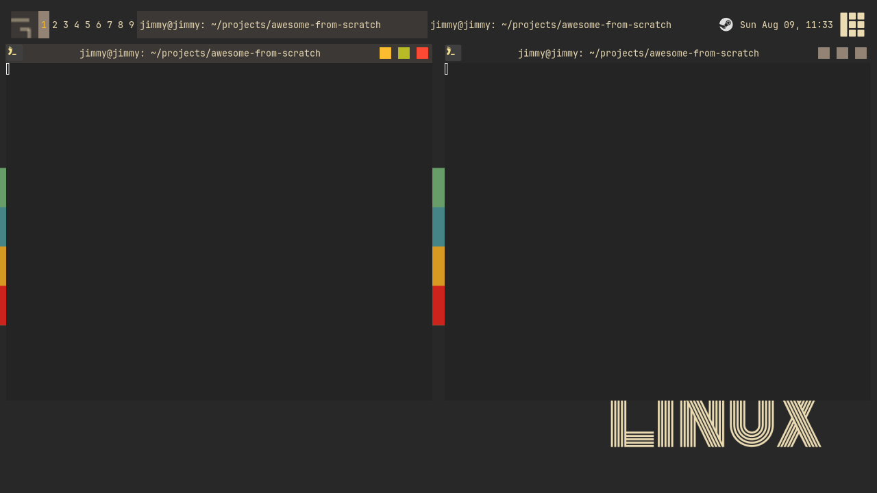
Checkpoint
The finished code for this chapter is on the 01-theme branch.
git checkout 01-theme
somewm-client test start --config "$PWD/rc.lua" --name afs
Compare your work: git diff 00-default 01-theme