kiln.widgets.toggle
A switch controlled by a boolean.
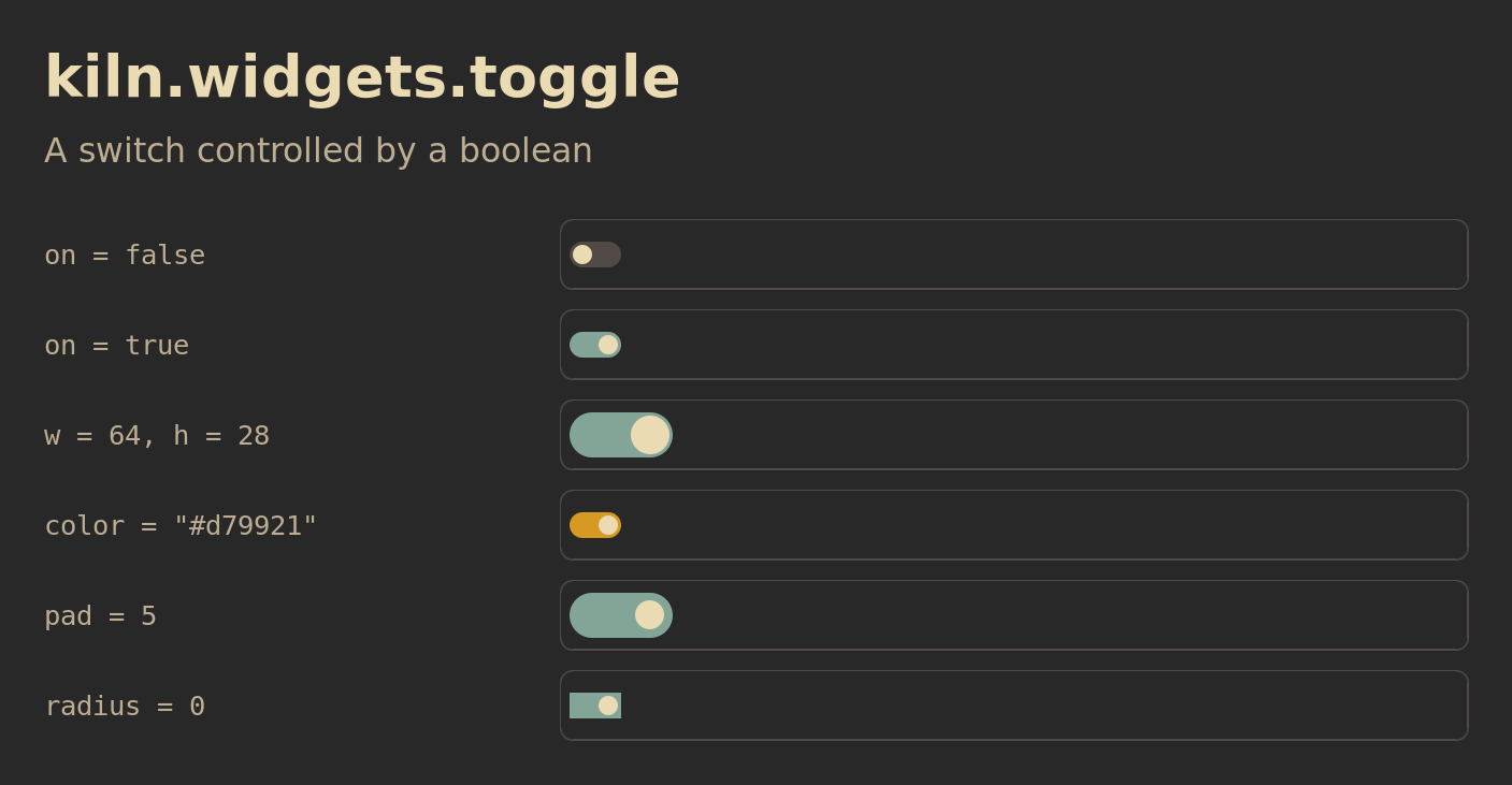
The switches are interactive in the Lua example. Each stores its own boolean.
Show Lua
Save the Lua file as /tmp/kiln-figure.lua, then run:
kiln-client eval 'dofile("/tmp/kiln-figure.lua")'
It opens on the focused screen and closes after two minutes. To close it early:
kiln-client eval 'if kiln_reference_figure then kiln_reference_figure.stop() end'
local kiln = require("kiln")
local ui, widgets = kiln.ui, kiln.widgets
if kiln_reference_figure then kiln_reference_figure.stop() end

local F = {
  bg = "#282828", fg = "#ebdbb2", panel = "#32302f", slot = "#504945",
  muted = "#bdae93", amber = "#d79921", blue = "#83a598", green = "#b8bb26",
  width = 940, label_width = 300,
}
function F.text(text, cfg)
  cfg = cfg or {}
  cfg.color = cfg.color or F.fg
  cfg.font = cfg.font or "Sans"
  cfg.size = cfg.size or 19
  ui.text(text, cfg)
end
function F.block(text, cfg)
  cfg = cfg or {}
  ui.box({ w = cfg.w or 72, h = cfg.h or 30, color = cfg.color or F.blue,
    radius = 4, align = "center" }, function()
    F.text(text, { color = F.bg, size = 16 })
  end)
end
function F.row(label, draw, opts)
  opts = opts or {}
  return function()
    ui.row({ w = "grow", gap = 20, align = { y = "center" } }, function()
      ui.box({ w = F.label_width }, function()
        F.text(label, { font = "monospace", size = 17, color = F.muted })
      end)
      ui.box({ w = "grow", h = opts.h or 44, pad = opts.pad or 6,
        radius = 8, border = { width = 1, color = F.slot },
        align = { y = "center" } }, draw)
    end)
  end
end
function F.scene(title, subtitle, rows, opts)
  opts = opts or {}
  local s = screen.focused or screen.all()[1]
  assert(s, "a screen is required")
  local popup = ui.popup {
    id = "kiln-reference-figure", screen = s, w = F.width, pad = 28, gap = 12,
    color = F.bg, fit = false, band = opts.band,
    fn = function()
      F.text(title, { size = 36, font = "Sans Bold" })
      F.text(subtitle, { size = 21, color = F.muted })
      ui.box({ h = 6 })
      for _, row in ipairs(rows) do row() end
    end,
  }
  local figure = { popup = popup, screen = s }
  function figure.stop()
    popup:destroy()
    if figure.timer then core.timer_cancel(figure.timer); figure.timer = nil end
    if kiln_reference_figure == figure then kiln_reference_figure = nil end
    if figure.cleanup then figure.cleanup() end
  end
  kiln_reference_figure = figure
  figure.timer = core.timer(120000, figure.stop)
  popup:show(s)
  return figure
end
function F.clients(count)
  local result = {}
  for _, c in ipairs(client.all()) do
    if c.mapped and not c.override_redirect then result[#result + 1] = c end
  end
  assert(#result >= count, "open " .. count .. " clients before running this figure")
  return result
end
function F.client_scene(title, subtitle, rows, opts)
  local previous = kiln.declare_clients
  local replacement = function() end
  kiln.declare_clients = replacement
  local figure = F.scene(title, subtitle, rows, opts)
  figure.cleanup = function()
    if kiln.declare_clients == replacement then kiln.declare_clients = previous end
    kiln.dirty()
  end
  return figure
end

local function toggle(label, cfg)
  local on = cfg.on or false
  cfg.track = F.slot
  cfg.press = function() on = not on; kiln.dirty() end
  return F.row(label, function() cfg.on = on; widgets.toggle(cfg) end)
end
return F.scene("kiln.widgets.toggle", "A switch controlled by a boolean", {
  toggle('on = false', { id = "toggle-off" }),
  toggle('on = true', { id = "toggle-on", on = true }),
  toggle('w = 64, h = 28', { id = "toggle-large", on = true, w = 64, h = 28 }),
  toggle('color = "#d79921"', { id = "toggle-amber", on = true, color = F.amber }),
  toggle('pad = 5', { id = "toggle-pad", on = true, w = 64, h = 28, pad = 5 }),
  toggle('radius = 0', { id = "toggle-square", on = true, radius = 0 }),
})
widgets.toggle(cfg)
Example
widgets.toggle {
  id = "mute", on = muted,
  press = function() muted = not muted; kiln.dirty() end,
}
Options
| Field | Type | Default | Behaviour |
|---|---|---|---|
id | string | nil | Optional track ID. The knob uses id .. ":knob". |
on | boolean | false | Selects the fill colour and knob alignment. |
press | function | nil | Called with the pointer event. Update on in your own state. |
w | number | 32 | Track width. |
h | number | 16 | Track height. |
pad | number | 2 | Inset around the knob. Knob size is h - 2 * pad. |
color | colour | theme.accent | Fill when on. |
track | colour | theme.muted | Fill when off. |
knob | colour | theme.fg | Knob colour. |
radius | number | floor(h / 2) | Track radius. The knob radius is half its size, rounded down. |
Behaviour
Declare local muted = false once at config load. The widget does not change it or schedule redraws itself. Keep h > 2 * pad.
Widget conventions cover declaration, state and IDs. The runnable form example includes this widget.