wibox.widget.systray
Shows the icons that applications publish over StatusNotifierItem, the D-Bus tray protocol. There is one systray per session: every call to the constructor returns the same widget, so its settings are shared across bars. Applications that only speak XEmbed do not appear; see Wayland vs X11.
Styling options
| Appearance | Settings | Available choices |
|---|---|---|
| Size and layout | base_size, horizontal, reverse | Icon size in pixels, row or column, reversed order. |
| Tray background and spacing | bg_systray, systray_icon_spacing, systray_paddings, systray_max_rows | Background, gaps, outer padding. One row; larger systray_max_rows values are not applied. |
| Icon image | icon_theme, per-application icon_override | Icon-theme lookup. icon_override is not applied in this version. |
| Hover | systray_hover_bg, systray_hover_scale | Background. Hover scaling is not applied in this version. |
| Attention | systray_urgent_bg, systray_urgent_style | Background. Dot, ring and glow indicators are not rendered in this version. |
| Application badges | systray_show_overlay, systray_overlay_* | Show or hide; size; four corners; circle, rounded rectangle or rectangular background. |
| Per-application styles | systray_icon_style | Exact ID/name rules or a function that returns a style table. |
| Context menus | systray_menu_* | Colours, border, font, dimensions and a callback to change menu entries. |
A badge is an overlay image supplied by the application. An attention indicator is a dot, ring or border drawn by SomeWM. They have separate settings. This version can use a badge to trigger an attention background, but cannot replace it with a ring.
For screenshots and complete examples, see Customise the systray.
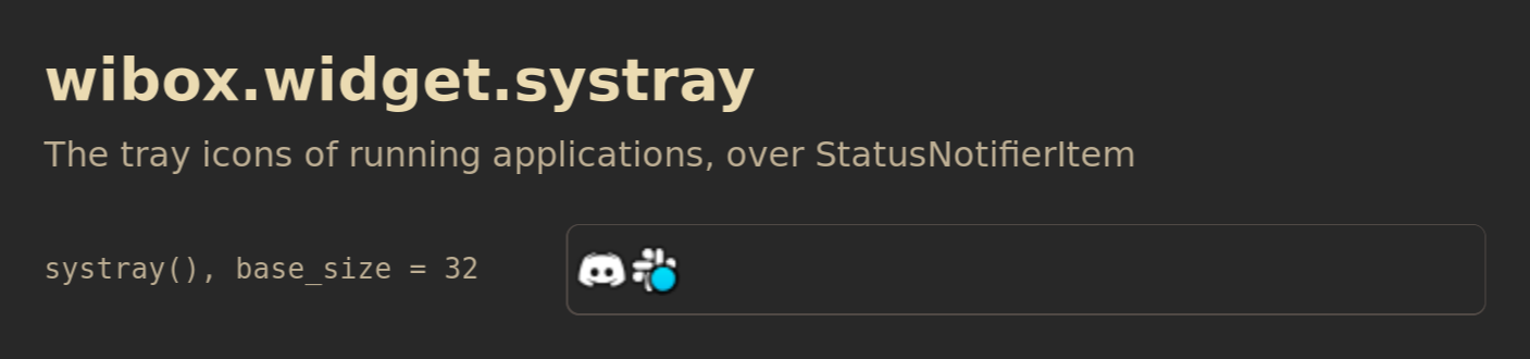
The row is the session's own tray. What it shows depends on what is running.
Show Lua
Save this as /tmp/widget-systray.lua, then run:
somewm-client eval 'dofile("/tmp/widget-systray.lua")'
It opens the figure on your focused screen and closes after two minutes. The figure shows the tray of the session it runs on.
-- Shared canvas for the SomeWM widget reference figures, in the style of the
-- 2.1.0 announcement diagrams: the session's theme colors and font family
-- with gruvbox fallbacks, a bold title and a muted subtitle, rounded cards
-- with one-pixel borders, 28 px margins, an ontop popup that closes itself.
--
-- generate.sh concatenates this file ahead of each scene and publishes the
-- result next to the PNG, so a reader can run the same file:
--   somewm-client eval 'dofile("/tmp/figure.lua")'
-- The scene calls F.scene(title, subtitle, rows). This file defines the
-- global F instead of returning a module because the concatenation is one
-- chunk with no package path.

local awful = require("awful")
local beautiful = require("beautiful")
local gears = require("gears")
local wibox = require("wibox")

if _G.somewm_reference_figure then _G.somewm_reference_figure.stop() end

F = {}

F.bg     = beautiful.bg_normal or "#282828"
F.fg     = beautiful.fg_normal or "#ebdbb2"
F.panel  = "#32302f"
F.slot   = "#504945"
F.muted  = "#bdae93"
F.amber  = "#d79921"
F.blue   = "#83a598"
F.green  = "#b8bb26"
F.family = (beautiful.font or "sans 10"):gsub("%s+%d+%.?%d*$", "")
F.font   = F.family .. " 14"
F.font_bold = F.family .. " Bold 14"
F.mono   = "monospace 13"

F.width       = 940
F.label_width = 300
F.slot_height = 44

function F.rounded(cr, w, h)
    gears.shape.rounded_rect(cr, w, h, 8)
end

-- A line of text in the figure's own font. size is in points.
function F.text(text, size, color, bold)
    return wibox.widget {
        markup = '<span foreground="' .. (color or F.fg) .. '">'
            .. gears.string.xml_escape(text) .. '</span>',
        font = F.family .. (bold and " Bold " or " ") .. size,
        widget = wibox.widget.textbox,
    }
end

-- A textbox in the figure font, for rows that show text. extra overrides
-- properties, which is how a row demonstrates one of them.
function F.label(text, extra)
    local t = { text = text, font = F.font, widget = wibox.widget.textbox }
    for k, v in pairs(extra or {}) do t[k] = v end
    return t
end

-- A solid block of a given size and color, for layout figures.
function F.block(w, h, color, text)
    return {
        text and {
            text = text, font = F.mono, halign = "center", valign = "center",
            widget = wibox.widget.textbox,
        } or nil,
        forced_width = w,
        forced_height = h,
        bg = color,
        fg = F.bg,
        shape = F.rounded,
        widget = wibox.container.background,
    }
end

-- One row: the property value in monospace, then the widget in a rounded
-- slot outlined in F.slot. The outline is the box the widget is given plus
-- opts.pad on each side (6 unless the scene needs the edge). opts.w and
-- opts.h size the slot; opts.fit lets it take the widget's own size.
function F.row(label, widget, opts)
    opts = opts or {}
    local slot = {
        { widget, margins = opts.pad or 6, widget = wibox.container.margin },
        border_width = 1,
        border_color = F.slot,
        shape = F.rounded,
        widget = wibox.container.background,
    }
    if not opts.fit then
        slot.forced_width = opts.w or (F.width - 56 - F.label_width - 20)
        slot.forced_height = opts.h or F.slot_height
    elseif opts.h then
        slot.forced_height = opts.h
    end
    return {
        {
            markup = '<span foreground="' .. F.muted .. '">' .. gears.string.xml_escape(label) .. '</span>',
            font = F.mono,
            ellipsize = "none",
            forced_width = F.label_width,
            widget = wibox.widget.textbox,
        },
        {
            slot,
            halign = "left",
            valign = "center",
            widget = wibox.container.place,
        },
        spacing = 20,
        layout = wibox.layout.fixed.horizontal,
    }
end

-- Build the figure as a centered popup on the primary screen, so every
-- capture comes from the same output and scale. It stays until
-- stop() runs or two minutes pass. Returns a message; generate.sh reads the
-- geometry from _G.somewm_reference_figure.popup once it has a size.
function F.scene(title, subtitle, rows)
    local target = screen.primary
    local contents = wibox.layout.fixed.vertical()
    contents.spacing = 12
    contents:add(F.text(title, 27, F.fg, true))
    contents:add(F.text(subtitle, 16, F.muted))
    contents:add(wibox.widget { forced_height = 6, widget = wibox.container.background })
    for _, r in ipairs(rows) do contents:add(wibox.widget(r)) end

    local popup = awful.popup {
        screen = target,
        visible = true,
        ontop = true,
        input_passthrough = true,
        bg = F.bg,
        fg = F.fg,
        minimum_width = F.width,
        maximum_width = F.width,
        placement = awful.placement.centered,
        widget = { contents, margins = 28, widget = wibox.container.margin },
    }
    local state = { popup = popup, screen = target }
    _G.somewm_reference_figure = state
    function state.stop()
        popup.visible = false
        if state.timer then state.timer:stop() end
        if _G.somewm_reference_figure == state then _G.somewm_reference_figure = nil end
    end
    state.timer = gears.timer.start_new(120, function() state.stop(); return false end)
    return title .. " figure opened on screen " .. target.index
end
-- wibox.widget.systray: the session's tray. There is one instance per
-- session, so one row.
return F.scene("wibox.widget.systray", "The tray icons of running applications, over StatusNotifierItem", {
    F.row('systray(), base_size = 32', { base_size = 32, widget = wibox.widget.systray }, { h = 56 }),
})
Download the Lua file. To close it early:
somewm-client eval 'if somewm_reference_figure then somewm_reference_figure.stop() end'
Constructor: wibox.widget.systray(reverse), returning the one instance. Upstream page.
local tray = wibox.widget.systray()
tray.base_size = 20
Properties
| Property | Type | Default | What it does | In SomeWM |
|---|---|---|---|---|
base_size | integer or nil | nil | Icon size in pixels. nil uses 24 pixels. | |
horizontal | boolean | true | Icons in a row, or in a column. | |
reverse | boolean | false | Reverses the item order. | |
screen | screen, "primary" or nil | "primary" | Stores the requested screen. | Does not filter the rendered icons by screen. |
For a tray on one monitor, include the widget only in that monitor's bar.
Setting a property emits property::<name>. The properties belong to the one instance, so the last value set wins wherever it was set.
Theme variables
These names are fields on beautiful, for example beautiful.systray_hover_bg = "#458588". Defaults below apply when the theme does not supply a value. Theme settings normally go after beautiful.init(...) and before bar creation.
Each setting lists its theme variable and, where supported, its Per-application key inside systray_icon_style. An omitted field inherits its theme variable. Settings marked Global only cannot be overridden through that table.
Tray, hover, attention and overlay backgrounds accept solid colours and gradients. Other Cairo patterns warn once and render transparent.
Tray layout
| Setting | Default and behaviour |
|---|---|
bg_systrayGlobal only | Default: nil.Tray background. Accepts a solid colour or gradient. Other patterns warn once and render transparent. |
systray_icon_spacingGlobal only | Default: 0.Integer gap between icons, in pixels. |
systray_paddingsGlobal only | Default: 0.Integer outer padding on all sides, in pixels. |
systray_max_rowsGlobal only | Default: 1.Positive integer. Values above 1 warn once and still render as one row. |
Icon images
| Setting | Default and behaviour |
|---|---|
icon_themeGlobal only | Default: "hicolor".Icon-theme name used for icon-name lookup. Application pixmaps and icons found in the application's own icon directory take precedence. |
icon_overridePer-application only | Default: nil.Not applied in this version. In 1.4 and 2.0 this accepts a replacement image path or icon-theme name. |
Hover
| Setting | Default and behaviour |
|---|---|
systray_hover_bgPer-application: hover_bg | Default: nil.Background while the pointer is over the icon. nil means no global hover background. |
systray_hover_scalePer-application: hover_scale | Default: 1.0.Not applied in this version. Values other than 1 warn once when hovered. |
Attention indicators
Attention styling appears when the item reports NeedsAttention. systray_overlay_triggers_urgent can also trigger it while an application overlay is present. Only the attention background is rendered in this version.
| Setting | Default and behaviour |
|---|---|
systray_urgent_bgPer-application: urgent_bg | Default: nil.Background while the item needs attention. When set, it takes precedence over the hover background. |
systray_urgent_stylePer-application: urgent_style | Default: "none".Not rendered in this version. The declared choices "none", "dot", "ring" and "glow" apply to 1.4 and 2.0. |
systray_urgent_colorPer-application: urgent_color | Default: "#ff3333".Not applied in this version. Indicator colour. |
systray_urgent_outline_colorPer-application: urgent_outline_color | Default: "#ffffff".Not applied in this version. Outline colour around the dot. Does not set the ring colour. |
systray_urgent_positionPer-application: urgent_position | Default: "top_right".Not applied in this version. Dot position: "top_left", "top_right", "bottom_left" or "bottom_right". |
systray_urgent_sizePer-application: urgent_size | Default: 0.25.Not applied in this version. Dot size. Numbers up to 1 are fractions of the icon size; larger numbers are pixels. Minimum 6 pixels in 1.4/2.0. |
systray_urgent_shapePer-application: urgent_shape | Default: gears.shape.circle.Not applied in this version. Shape function (cr, width, height) for the dot and ring. Does not affect "glow". |
systray_overlay_triggers_urgentPer-application: overlay_triggers_urgent | Default: false.Boolean. An application overlay triggers attention styling even if the item status is Active. Works when the overlay is hidden. |
systray_icon_change_triggers_urgentPer-application: icon_change_triggers_urgent | Default: false.Not applied in this version. Icon changes do not trigger attention styling. |
systray_show_overlay = false hides the badge. Combined with systray_overlay_triggers_urgent = true and systray_urgent_bg, the badge can trigger a background instead. Setting systray_urgent_style = "ring" has no effect in this version.
Application badges
A badge is the item's overlay image. These settings do not create a badge or notification count. The application must supply the overlay.
| Setting | Default and behaviour |
|---|---|
systray_show_overlayGlobal only | Default: true.Boolean. Show or hide application overlays. |
systray_overlay_positionPer-application: overlay_position | Default: "bottom_right"."top_left", "top_right", "bottom_left" or "bottom_right". |
systray_overlay_sizePer-application: overlay_size | Default: 0.33.Number. Up to 1: fraction of the icon size. Above 1: pixels. Rounded to whole pixels. |
systray_overlay_bgPer-application: overlay_bg | Default: nil.Background behind the overlay. nil draws no global background. |
systray_overlay_shapePer-application: overlay_shape | Default: "circle"."circle", "rounded_rect" or "rect". Shapes the background, not the overlay image; has no visible effect without overlay_bg. |
systray_overlay_paddingPer-application: overlay_padding | Default: 2.Padding around the overlay within its background, in pixels. Used only when the background is set. |
systray_overlay_triggers_urgent controls whether a badge also triggers attention styling. Hiding the badge does not disable that trigger.
Per-application styles
beautiful.systray_icon_style defaults to nil. It accepts either:
- A table mapping an exact
item.idoritem.app_nameto a style table. The ID match takes precedence; the two matching tables are not merged. - A function
function(item)returning a style table. Errors and non-table return values are ignored.
The style table accepts every key labelled Per-application above. It does not accept the global-only layout, menu or systray_show_overlay settings. Fields marked Not applied or Not rendered remain ineffective inside a per-application rule.
local beautiful = require("beautiful")

beautiful.systray_icon_style = {
    ["discord_status_icon_1"] = {
        hover_bg = "#458588",
        urgent_bg = "#cc241d",
        overlay_position = "top_right",
        overlay_triggers_urgent = true,
    },
}
The ID is supplied by the tray item, not the window class. Find tray IDs shows the inspection command. Assigning another systray_icon_style table replaces the previous rules. false can disable a per-application boolean trigger even when its global value is true.
Context menus
These variables style menus SomeWM builds from DBusMenu. They do not style menus drawn by the application itself. All are global-only. A missing systray menu value falls back to the corresponding beautiful.menu_* value, then the normal awful.menu defaults.
| Setting | Fallback and behaviour |
|---|---|
systray_menu_fg_normal | Fallback: beautiful.menu_fg_normal.Colour of item text. |
systray_menu_bg_normal | Fallback: beautiful.menu_bg_normal.Menu background colour. |
systray_menu_fg_focus | Fallback: beautiful.menu_fg_focus.Colour of selected item text. |
systray_menu_bg_focus | Fallback: beautiful.menu_bg_focus.Selected item background colour. |
systray_menu_border_color | Fallback: beautiful.menu_border_color.Menu border colour. |
systray_menu_border_width | Fallback: beautiful.menu_border_width.Number. Border width in pixels. |
systray_menu_font | Fallback: beautiful.menu_font.Pango font string, such as "sans 10". |
systray_menu_width | Fallback: beautiful.menu_width.Number. Menu item width in pixels. |
systray_menu_height | Fallback: beautiful.menu_height.Number. Menu item height in pixels. |
systray_menu_callback | Fallback: nil.Function (item, menu_items) called before a DBusMenu is shown. Can edit menu_items or return a replacement table. Returning nil keeps the original table, including edits. Errors are ignored. |
Gone in SomeWM 2.1: awesome.systray, the C entry point. wibox.widget.systray_icon is the per-item widget the tray lays out.
The common properties, methods and signals apply.