wibox.widget.slider
A bar with a handle the pointer can drag. value moves between minimum and maximum and emits property::value as it goes. Give it a size with forced_width and forced_height.
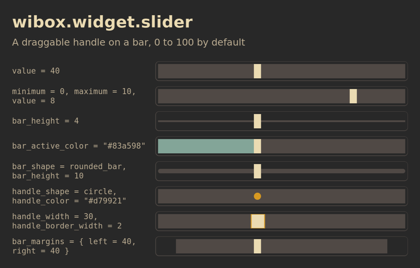
Each row sets one property. The outline is the box the widget was given.
Show Lua
Save this as /tmp/widget-slider.lua, then run:
somewm-client eval 'dofile("/tmp/widget-slider.lua")'
It opens the figure on your focused screen and closes after two minutes. Every row is a 300 by 24 slider at 40 with one property set.
-- Shared canvas for the SomeWM widget reference figures, in the style of the
-- 2.1.0 announcement diagrams: the session's theme colors and font family
-- with gruvbox fallbacks, a bold title and a muted subtitle, rounded cards
-- with one-pixel borders, 28 px margins, an ontop popup that closes itself.
--
-- generate.sh concatenates this file ahead of each scene and publishes the
-- result next to the PNG, so a reader can run the same file:
--   somewm-client eval 'dofile("/tmp/figure.lua")'
-- The scene calls F.scene(title, subtitle, rows). This file defines the
-- global F instead of returning a module because the concatenation is one
-- chunk with no package path.

local awful = require("awful")
local beautiful = require("beautiful")
local gears = require("gears")
local wibox = require("wibox")

if _G.somewm_reference_figure then _G.somewm_reference_figure.stop() end

F = {}

F.bg     = beautiful.bg_normal or "#282828"
F.fg     = beautiful.fg_normal or "#ebdbb2"
F.panel  = "#32302f"
F.slot   = "#504945"
F.muted  = "#bdae93"
F.amber  = "#d79921"
F.blue   = "#83a598"
F.green  = "#b8bb26"
F.family = (beautiful.font or "sans 10"):gsub("%s+%d+%.?%d*$", "")
F.font   = F.family .. " 14"
F.font_bold = F.family .. " Bold 14"
F.mono   = "monospace 13"

F.width       = 940
F.label_width = 300
F.slot_height = 44

function F.rounded(cr, w, h)
    gears.shape.rounded_rect(cr, w, h, 8)
end

-- A line of text in the figure's own font. size is in points.
function F.text(text, size, color, bold)
    return wibox.widget {
        markup = '<span foreground="' .. (color or F.fg) .. '">'
            .. gears.string.xml_escape(text) .. '</span>',
        font = F.family .. (bold and " Bold " or " ") .. size,
        widget = wibox.widget.textbox,
    }
end

-- A textbox in the figure font, for rows that show text. extra overrides
-- properties, which is how a row demonstrates one of them.
function F.label(text, extra)
    local t = { text = text, font = F.font, widget = wibox.widget.textbox }
    for k, v in pairs(extra or {}) do t[k] = v end
    return t
end

-- A solid block of a given size and color, for layout figures.
function F.block(w, h, color, text)
    return {
        text and {
            text = text, font = F.mono, halign = "center", valign = "center",
            widget = wibox.widget.textbox,
        } or nil,
        forced_width = w,
        forced_height = h,
        bg = color,
        fg = F.bg,
        shape = F.rounded,
        widget = wibox.container.background,
    }
end

-- One row: the property value in monospace, then the widget in a rounded
-- slot outlined in F.slot. The outline is the box the widget is given plus
-- opts.pad on each side (6 unless the scene needs the edge). opts.w and
-- opts.h size the slot; opts.fit lets it take the widget's own size.
function F.row(label, widget, opts)
    opts = opts or {}
    local slot = {
        { widget, margins = opts.pad or 6, widget = wibox.container.margin },
        border_width = 1,
        border_color = F.slot,
        shape = F.rounded,
        widget = wibox.container.background,
    }
    if not opts.fit then
        slot.forced_width = opts.w or (F.width - 56 - F.label_width - 20)
        slot.forced_height = opts.h or F.slot_height
    elseif opts.h then
        slot.forced_height = opts.h
    end
    return {
        {
            markup = '<span foreground="' .. F.muted .. '">' .. gears.string.xml_escape(label) .. '</span>',
            font = F.mono,
            ellipsize = "none",
            forced_width = F.label_width,
            widget = wibox.widget.textbox,
        },
        {
            slot,
            halign = "left",
            valign = "center",
            widget = wibox.container.place,
        },
        spacing = 20,
        layout = wibox.layout.fixed.horizontal,
    }
end

-- Build the figure as a centered popup on the primary screen, so every
-- capture comes from the same output and scale. It stays until
-- stop() runs or two minutes pass. Returns a message; generate.sh reads the
-- geometry from _G.somewm_reference_figure.popup once it has a size.
function F.scene(title, subtitle, rows)
    local target = screen.primary
    local contents = wibox.layout.fixed.vertical()
    contents.spacing = 12
    contents:add(F.text(title, 27, F.fg, true))
    contents:add(F.text(subtitle, 16, F.muted))
    contents:add(wibox.widget { forced_height = 6, widget = wibox.container.background })
    for _, r in ipairs(rows) do contents:add(wibox.widget(r)) end

    local popup = awful.popup {
        screen = target,
        visible = true,
        ontop = true,
        input_passthrough = true,
        bg = F.bg,
        fg = F.fg,
        minimum_width = F.width,
        maximum_width = F.width,
        placement = awful.placement.centered,
        widget = { contents, margins = 28, widget = wibox.container.margin },
    }
    local state = { popup = popup, screen = target }
    _G.somewm_reference_figure = state
    function state.stop()
        popup.visible = false
        if state.timer then state.timer:stop() end
        if _G.somewm_reference_figure == state then _G.somewm_reference_figure = nil end
    end
    state.timer = gears.timer.start_new(120, function() state.stop(); return false end)
    return title .. " figure opened on screen " .. target.index
end
-- wibox.widget.slider: a handle on a bar, in a few styles.
local function slider(extra)
    local t = { value = 40, forced_width = 300, forced_height = 24, bar_color = F.slot, handle_color = F.fg, widget = wibox.widget.slider }
    for k, v in pairs(extra or {}) do t[k] = v end
    return t
end
return F.scene("wibox.widget.slider", "A draggable handle on a bar, 0 to 100 by default", {
    F.row('value = 40', slider()),
    F.row('minimum = 0, maximum = 10, value = 8', slider { minimum = 0, maximum = 10, value = 8 }),
    F.row('bar_height = 4', slider { bar_height = 4 }),
    F.row('bar_active_color = "#83a598"', slider { bar_active_color = F.blue }),
    F.row('bar_shape = rounded_bar, bar_height = 10', slider { bar_shape = gears.shape.rounded_bar, bar_height = 10 }),
    F.row('handle_shape = circle, handle_color = "#d79921"', slider { handle_shape = gears.shape.circle, handle_color = F.amber }),
    F.row('handle_width = 30, handle_border_width = 2', slider { handle_width = 30, handle_border_width = 2, handle_border_color = F.amber }),
    F.row('bar_margins = { left = 40, right = 40 }', slider { bar_margins = { left = 40, right = 40 } }),
})
Download the Lua file. To close it early:
somewm-client eval 'if somewm_reference_figure then somewm_reference_figure.stop() end'
Constructor: wibox.widget.slider(args). Upstream page.
local brightness = wibox.widget {
    minimum          = 0,
    maximum          = 100,
    value            = 70,
    forced_width     = 120,
    forced_height    = 20,
    bar_shape        = gears.shape.rounded_bar,
    bar_height       = 4,
    bar_color        = "#504945",
    bar_active_color = "#83a598",
    handle_shape     = gears.shape.circle,
    handle_color     = "#ebdbb2",
    widget           = wibox.widget.slider,
}
brightness:connect_signal("property::value", function(_, v) set_brightness(v) end)
Properties
| Property | Type | Default | What it does | In SomeWM |
|---|---|---|---|---|
value | number | 0 | The handle position between minimum and maximum. | |
minimum | number | 0 | The value at the left. | |
maximum | number | 100 | The value at the right. | |
bar_shape | function | beautiful.slider_bar_shape, else rectangle | Shape of the bar. | |
bar_height | number | beautiful.slider_bar_height, else the widget height | Bar thickness. | |
bar_color | color | beautiful.slider_bar_color | Bar fill. A gradient is drawn in the bar's box. | A value that is not solid or a gradient warns once and is transparent. |
bar_active_color | color | beautiful.slider_bar_active_color | Fill of the bar left of the handle. | Same rule. |
bar_margins | number or table | beautiful.slider_bar_margins, else {} | Space between the widget edge and the bar. | |
handle_shape | function | beautiful.slider_handle_shape, else rectangle | Shape of the handle. | |
handle_color | color | beautiful.slider_handle_color | Handle fill. | Unset, the handle takes the bar color and warns once. |
handle_width | number | beautiful.slider_handle_width, else the widget height | Handle width. | Unset with a bar_height, it is half the bar height and warns once. |
handle_border_width | number | beautiful.slider_handle_border_width, else 0 | Handle outline. | |
handle_border_color | color | beautiful.slider_handle_border_color | Outline color. | Must be solid or it warns once and is transparent. |
handle_cursor | string | "fleur" | Pointer cursor while dragging. |
Setting a property emits property::<name>. Dragging emits property::value for every change.
Gone in SomeWM 2.1: bar_border_color, bar_border_width and handle_margins, with their slider_* theme variables.
The common properties, methods and signals apply.